Too wordy.
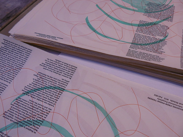
 Every time I start a new pamphlet, I pretend that this one won’t be so wordy, but clearly I’m failing at this.
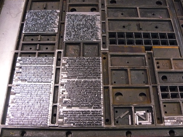
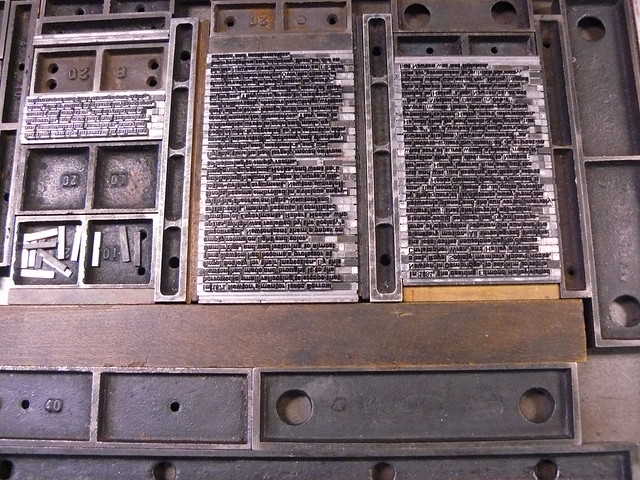
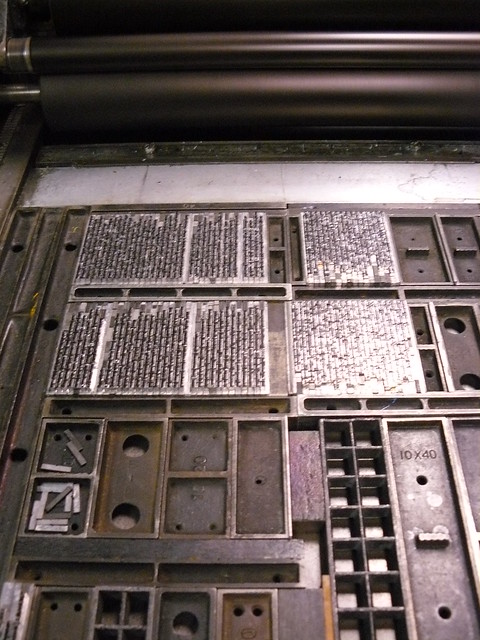
If I could just restrain myself, I’d be done by now. When I bought the type I’m using for the series, it was just about enough to set the whole thing. Those days are long gone. Each pamphlet gets wordier, which means more type. When I run out of letters, I have to print what I have, put everything back, then set the next bit, etc. At this point, I think I’m going to have to set, distribute, set, distribute, and set, distribute, set in order to get this one done.
Which is ok, I mean, obviously I like setting type. This is what I willingly did with my holiday weekend. I hope yours was just as pleasant and productive.


what typeface are you using? which is your favorite?
i just set a 3000 word story in centaur. couldn’t decide how i wanted to lay it out for sure, so i planned for 4 different versions, some in a pamplet/booklet signature, others the two-ups were side by side, an interesting puzzle given being out of sorts…
I’m using 10 pt Franklin Gothic; I’m generally a big fan of 19th century gothics and sans serifs that aren’t too geometric. I like a stacked a and a nice g. I more or less have a standard size/format for the pamphlets at this point just so there’s one less element to think about. I wouldn’t want to have to plan out multiple binding options at the same time!
ah. i like irregular but clean typefaces, nicholas cochin, centaur to start with, the multiple binding thing just about blew my circuits, i hope i don’t do too many more of them.
[…] more information here and here and here about how it was […]